iPhone 6 review 9/26/14

After two years with an iPhone 5, I was excited to get an iPhone 6 (not 6 Plus) last Friday1. One week in, these are my thoughts:
Size
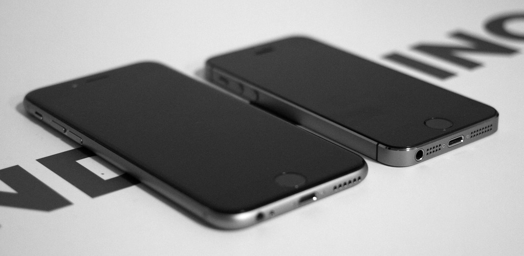
The big news this year is that both iPhone models are bigger, and significantly so. The size increase of the baseline model has been nice for reading and browsing the web, but there are definite trade-offs. I can no longer reach all the corners of the screen with my thumb, and as a result, I feel the need to hold the phone with both hands most of the time. I can only imagine the frustration users with smaller hands might feel, and I’m honestly a bit surprised that Apple is not yet offering a new smaller model2.
The increased width as well as the rounded sides make for a phone that’s more difficult to grip. It’s felt precarious enough that I’ve ordered my first ever iPhone case3.
While we’re in this transition period to the new sizes, a lot of apps have yet to be upgraded to take advantage of the increased space natively. That means you’ll encounter some slightly blurry looking apps. It’s not too terrible, but I’ll be happy when my most used apps are all updated4.
Looks
This is the most friendly looking iPhone since the 3 and 3GS. The 6’s rounded edges and glass harken back to the original iPhone model, which is still my favorite iPhone in terms of ergonomics and feel. And while I loved the looks of the 4 and 5, they were unabashedly industrial looking with their stainless steel and sharp edges.
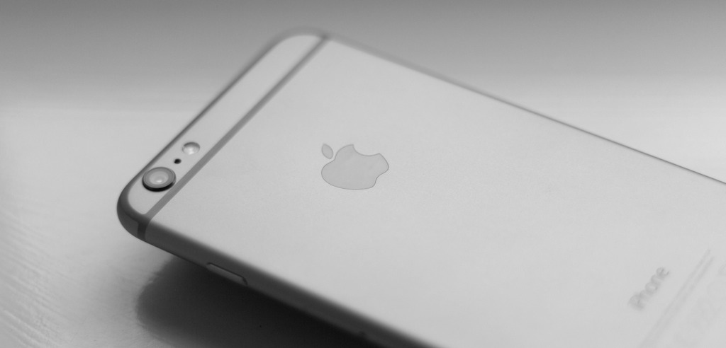
There are two downsides to the new look, the bulge for the camera lens and the odd looking antenna lines on the back:

When the phones were announced I was worried my fingers would be drawn to the camera lens. However, in my daily use I have not found this to be the case at all. The phone’s increased size means my fingers are rarely near that part of the casing.
The lines are less forgivable. They are there because the iPhone antennas need something to send and receive signals through, but they just look odd. The glass chin and forehead on the 5 and 5S looked cleaner and more premium.
Features
My last iPhone was an iPhone 5, so this is my first experience with Touch ID. So far the accuracy and speed have been stellar. I’ve trained it to recognize both my thumbs and pointer fingers, and the there has only been one time the last few days where my phone didn’t immediately recognize my print. I can’t wait to use it with Apple Pay in the future.
The new camera is a nice upgrade. Check out this Verge article for some sample shots of what is capable with the new lens and sensor. I’m particularly enamored with the slo-mo feature:
With the larger screen and Touch ID button comes Reachability, which is a shortcut to bring the top of the screen within thumbs reach of the bottom of phone. You can activate and deactivate it by double touching the home button (you don’t actually press the home button in, you tap it like you would a button on the touch screen). It’s an odd seeming feature, but one I’ve used a few times with success5.
One welcome, and unexpected change is the bottom speaker. It’s significantly louder than one on the iPhone 56. No longer will you have to resort to using headphones to hear a video even in a quiet room. The rounded body also means that you’re less likely to block the entire speaker with your hand when holding it.
iOS 8
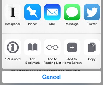
iOS 8 is available for older iPhones as well as the 6, and it adds a few compelling features. The biggest and best is Extensibility. Extensibility allows apps to register system-wide helpers you can use in other apps. For instance, if you use Instapaper, you can enable an extension in Safari to save the web page you’re reading. Another big one is the new 1Password extension to fill in your username and password. Providing this sort of app-to-app communication is something that has long been on my personal iOS wishlist and I’m pleased it’s now a reality7.

iOS 8 now let’s you install custom keyboards. I haven’t used them much, but if you’d like to know more, check out this custom keyboard round-up at MacStories.
There’s also some cool little features:
- You can set Duck Duck Go as your default search engine.
- Siri is faster and more accurate.
- Safari has a mode to try and load desktop versions of websites.
- The default keyboard has an uncanny new prediction bar.
Conclusion
As upgrades go, the iPhone 6 is a substantial improvement over the 5. The new size is a bit unwieldy, especially when holding it with one hand. However, the added screen real estate, Touch ID, and the better camera are improvements that will enhance your experience with the phone every single day.
iPhone 5 and 6 comparison photo by LWYang. Licensed under Creative Commons.
iPhone 6 back photo by William Hook. Licensed under Creative Commons.
-
I bought the Verizon 64 GB model in ‘space’ gray. I would have bought a 32 GB model if Apple made one, but they decided to only offer 16, 64 and 128 GB models. Presumably they know people like me will have to spend the extra $100 to get a usable model, because 16 GB just isn’t enough space, unless you never take photos or download apps/music/videos. ↩
-
Nothing is stopping Apple from releasing a new smaller iPhone next year. It seems unlikely, but enough potential buyers could be clamoring for it. ↩
-
I purchased Apple’s black leather case. I’ve only had it for a few hours, but I can confidently say it adds a good amount of grip without increasing the size or weight too much. ↩
-
Kudos to the developers who were ready on Friday with new versions. ↩
-
I imagine it will get a lot of use in situations where you only have one hand free, like when you’re standing on a train holding the railing, or holding a drink. ↩
-
It’s also a lot louder than the iPad Mini speaker. My wife bought a Nexus 7 for watching Netflix instead of an iPad Mini because of the weak speaker. ↩
-
Yes, Android has had this feature forever. ↩
