MacOS interface used to be joyful 7/25/16
Great blog post by Nicholas Howard on how Apple drained a lot of the joy from the Mac OS UI starting with Yosemite.
OS X, while not quite as committed as Windows 8+ to purging all meaningful metaphors from the operating system, has chased the trend. The ideological roots of the redesigns are flimsy: thickly coated with bloated art theory language, so that no common person can detect their flimsiness, they throw aside genuinely good ideas such as ease-of-use, personality, and beauty in their obsessive quest to remove all references to the physical world from computer software.
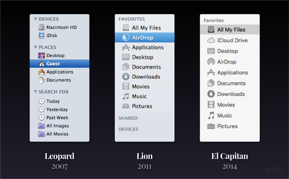
It is a laudable goal to have more timeless designs in the UI, but I wish it hadn’t come at the expense of usability. Notice how Apple removed all the color cues from the Finder sidebar:

Now you have to carefully read and consider each sidebar item before you click. Before it was easy to recognize general colors like purple for the desktop or yellow & red for Applications.
If you’re at all concerned about the evolution of the Mac UI, I definitely recommend reading Howard’s entire post.
