Preparing your website for the iPhone X 9/27/17
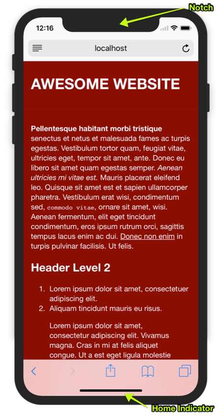
Apple’s latest and greatest iPhone, the iPhone X, will be here soon and it’s going to change how we design and develop for the web, whether we like it or not 1. The iPhone X screen is no longer square, it has a notch at the top that houses a camera and other sensors, a floating home indicator at the bottom of the screen that replaces the now-defunct home button, and rounded corners at the edges of the screen.
Don’t panic, By default your site will look OK (especially in portrait) but there are some techniques we can use to make our sites adapt better to the non-square screen of the iPhone X.
Dealing with the notch in landscape
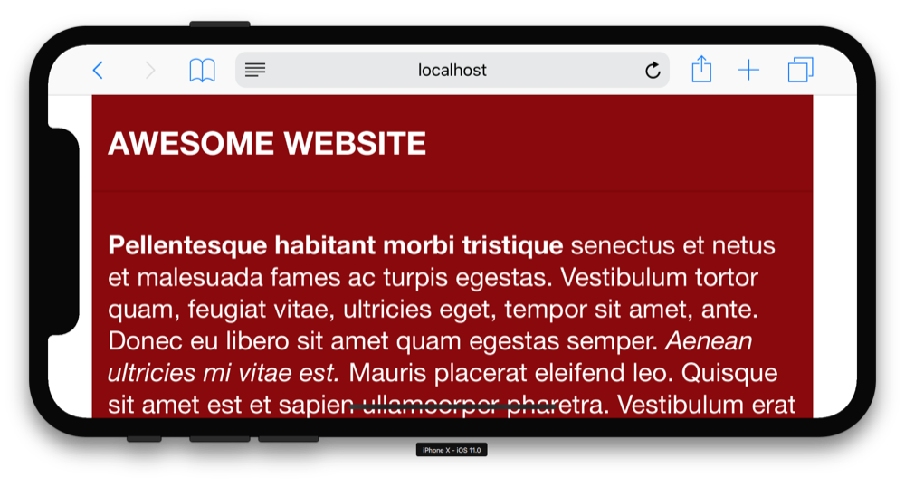
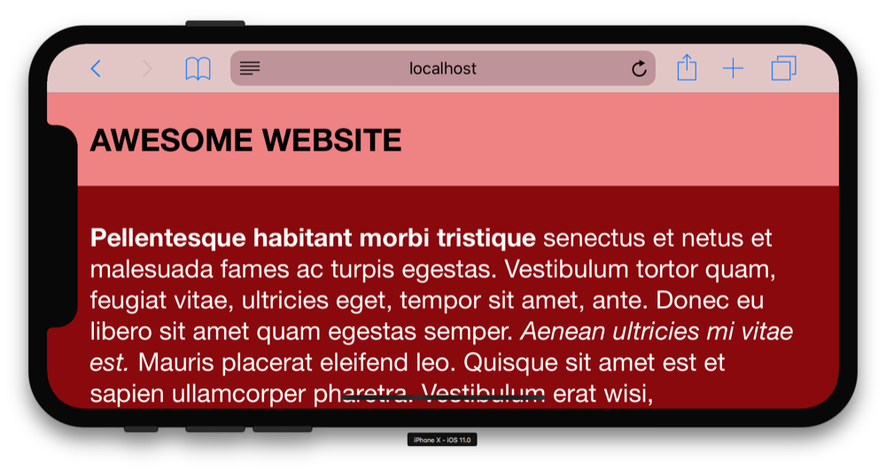
The notch isn’t a problem for your website until you flip the phone to landscape, then your website will have white bars on the sides to leave space for the notch.
If you want to extend your site’s background color to the sides, the simplest technique is to put a background color on the body or html tag in your CSS.
.body {
	background-color: darkred;
}
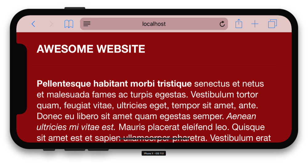
Look great right? But this pretty much only works with solid color backgrounds. If you have different colors for your headers and footers, you’ll want to check out the next section.
Dealing with the home indicator and the rounded corners
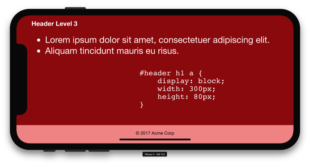
If your website background isn’t simply a flat color from top to bottom, start by adding viewport-fit=cover to your meta viewport tag to stretch the page content to the edges of the screen:
<meta name="viewport" content="width=device-width, initial-scale=1.0, viewport-fit=cover">
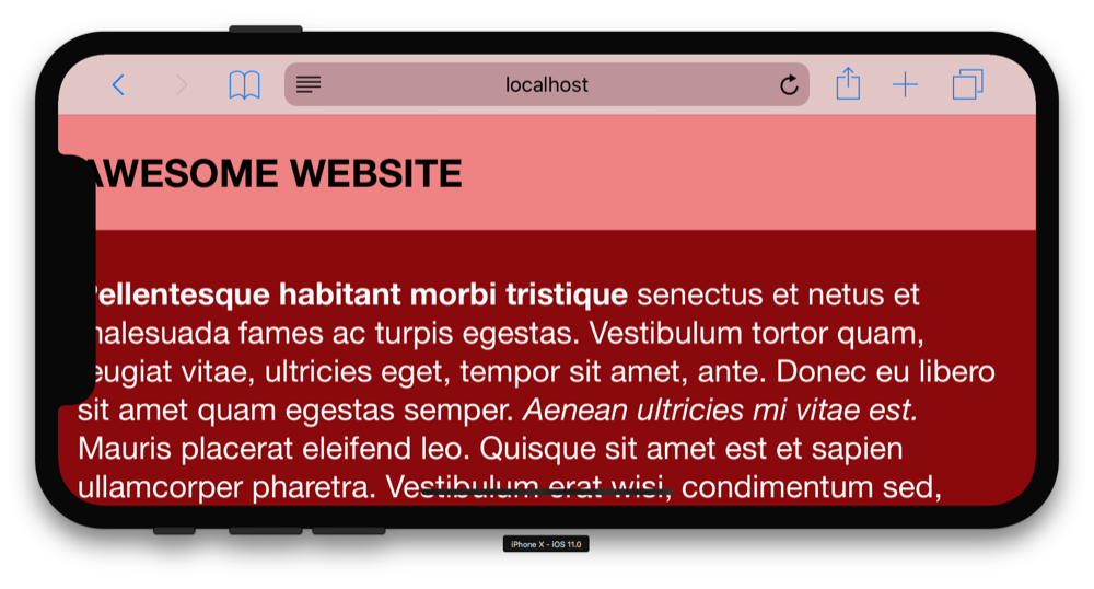
As you can see, now our content is stretching to the edges, but it’s also being overlapped by the notch and coming uncomfortably close to the rounded corners. It’s up to us to use some new iPhone X specific CSS environment variables safe-area-inset-left, safe-area-inset-right, safe-area-inset-top, and safe-area-inset-bottom to position our content.
For my test webpage, the following CSS did the trick to keep the text away from the notch and rounded corners while also preventing the home indicator from overlapping the footer text. You’ll need to figure out exactly how to use the environment variables for your layout.
.container {
	padding-left: env(safe-area-inset-left);
	padding-right: env(safe-area-inset-right);
}

.footer {
	padding-bottom: env(safe-area-inset-bottom);
}
Testing
Until the official release of the iPhone X, the best way to test is with the simulator included in the latest version of Xcode. Xcode is free, but you will need a computer running MacOS to use it.
Further reading
If you’d like to learn more, check out Stephen Radford’s blog post where I first learned about these techniques, or read the official Webkit primer on the iPhone X.
-
iPhones are simply too popular to ignore. ↩